Introduction
At a high level, the goal of epipredict is to make it easy to run simple machine learning and statistical forecasters for epidemiological data. To do this, we have extended the tidymodels framework to handle the case of panel time-series data.
Our hope is that it is easy for users with epidemiological training and some statistical knowledge to fit baseline models, while also allowing those with more nuanced statistical understanding to create complex custom models using the same framework. Towards that end, epipredict provides two main classes of tools:
Canned forecasters
A set of basic, easy-to-use “canned” forecasters that work out of the box. We currently provide the following basic forecasters:
- Flatline forecaster: predicts as the median the most recently seen value with increasingly wide quantiles.
- Climatological forecaster: predicts the median and quantiles based on the historical values around the same date in previous years.
- Autoregressive forecaster: fits a model (e.g. linear regression) on lagged data to predict quantiles for continuous values.
- Autoregressive classifier: fits a model (e.g. logistic regression) on lagged data to predict a binned version of the growth rate.
- CDC FluSight flatline forecaster: a variant of the flatline forecaster that is used as a baseline in the CDC’s FluSight forecasting competition.
Forecasting framework
A framework for creating custom forecasters out of modular components, from which the canned forecasters were created. There are three types of components:
-
Preprocessor: transform the data before model training,
such as converting counts to rates, creating smoothed columns, or any
{recipes}step -
Trainer: train a model on data, resulting in a fitted model
object. Examples include linear regression, quantile regression, or any
{parsnip}engine. -
Postprocessor: unique to epipredict; used to
transform the predictions after the model has been fit, such as
- generating quantiles from purely point-prediction models,
- reverting operations done in the
steps, such as converting from rates back to counts - generally adapting the format of the prediction to its eventual use.
The rest of this “Get Started” vignette will focus on using and modifying the canned forecasters. Check out the Custom Epiworkflows vignette for examples of using the forecaster framework to make more complex, custom forecasters.
If you are interested in time series in a non-panel data context, you may also want to look at timetk and modeltime for some related techniques.
For a more in-depth treatment with some practical applications, see also the Forecasting Book.
Panel forecasting basics
Example data
The forecasting methods in this package are designed to work with
panel time series data in epi_df format as made available
in the epiprocess package. An epi_df is a
collection of one or more time-series indexed by one or more categorical
variables. The {epidatasets}
package makes several pre-compiled example datasets available. Let’s
look at an example epi_df:
covid_case_death_rates
#> An `epi_df` object, 20,496 x 4 with metadata:
#> * geo_type  = state
#> * time_type = day
#> * as_of     = 2023-03-10
#>
#> # A tibble: 20,496 × 4
#>   geo_value time_value case_rate death_rate
#> * <chr>     <date>         <dbl>      <dbl>
#> 1 ak        2020-12-31      35.9      0.158
#> 2 al        2020-12-31      65.1      0.438
#> 3 ar        2020-12-31      66.0      1.27
#> 4 as        2020-12-31       0        0
#> 5 az        2020-12-31      76.8      1.10
#> 6 ca        2020-12-31      95.9      0.755
#> # ℹ 20,490 more rows
This dataset uses a single key, geo_value, and two
separate time series, case_rate and
death_rate. The keys are represented in “long” format, with
separate columns for the key and the value, while separate time series
are represented in “wide” format with each time series stored in a
separate column.
epiprocess is designed to handle data that always has
a geographic key, and potentially other key values, such as age,
ethnicity, or other demographic information. For example,
grad_employ_subset from epidatasets also has
both age_group and edu_qual as additional
keys:
grad_employ_subset
#> An `epi_df` object, 1,445 x 7 with metadata:
#> * geo_type  = custom
#> * time_type = integer
#> * other_keys = age_group, edu_qual
#> * as_of     = 2024-09-18
#>
#> # A tibble: 1,445 × 7
#>   geo_value           age_group      edu_qual        time_value num_graduates
#> * <chr>               <fct>          <fct>                <int>         <dbl>
#> 1 Newfoundland and L… 15 to 34 years Career, techni…       2010           430
#> 2 Newfoundland and L… 35 to 64 years Career, techni…       2010           140
#> 3 Newfoundland and L… 15 to 34 years Career, techni…       2010           630
#> 4 Newfoundland and L… 35 to 64 years Career, techni…       2010           140
#> 5 Newfoundland and L… 15 to 34 years Other career, …       2010            60
#> 6 Newfoundland and L… 35 to 64 years Other career, …       2010            40
#> # ℹ 1,439 more rows
#> # ℹ 2 more variables: med_income_2y <dbl>, med_income_5y <dbl>
See epiprocess for more
details on the epi_df format.
Panel time series are ubiquitous in epidemiology, but are also common in economics, psychology, sociology, and many other areas. While this package was designed with epidemiology in mind, many of the techniques are more broadly applicable.
Customizing arx_forecaster()
Let’s expand on the basic example presented on the landing page, starting with
adjusting some parameters in arx_forecaster().
The trainer argument allows us to set the fitting
engine. We can use either one of the included engines, such as
quantile_reg(), or one of the relevant parsnip models:
two_week_ahead <- arx_forecaster(
  covid_case_death_rates |> filter(time_value <= forecast_date),
  outcome = "death_rate",
  trainer = quantile_reg(),
  predictors = c("death_rate"),
  args_list = arx_args_list(
    lags = list(c(0, 7, 14)),
    ahead = 14
  )
)
hardhat::extract_fit_engine(two_week_ahead$epi_workflow)
#> Call:
#> quantreg::rq(formula = ..y ~ ., tau = ~c(0.05, 0.1, 0.25, 0.5,
#> 0.75, 0.9, 0.95), data = data, na.action = stats::na.omit, method = ~"br",
#>     model = FALSE)
#>
#> Coefficients:
#>                      tau= 0.05  tau= 0.10 tau= 0.25  tau= 0.50  tau= 0.75
#> (Intercept)       -0.004873168 0.00000000 0.0000000 0.01867752 0.03708118
#> lag_0_death_rate   0.084091001 0.15180503 0.3076742 0.51165423 0.59058733
#> lag_7_death_rate   0.049478502 0.08493916 0.1232253 0.10018481 0.18480536
#> lag_14_death_rate  0.072304151 0.08554334 0.0712085 0.04088075 0.02609046
#>                    tau= 0.90 tau= 0.95
#> (Intercept)       0.07234641 0.1092061
#> lag_0_death_rate  0.59001978 0.5249616
#> lag_7_death_rate  0.33236190 0.4250353
#> lag_14_death_rate 0.03695928 0.1783820
#>
#> Degrees of freedom: 10416 total; 10412 residual
The default trainer is parsnip::linear_reg(), which
generates quantiles after the fact in the post-processing layers, rather
than as part of the model. While this does work, it is generally
preferable to use quantile_reg(), as the quantiles
generated in post-processing can be poorly behaved.
quantile_reg() on the other hand directly estimates a
different linear model for each quantile, reflected in the several
different columns for tau above.
Because of the flexibility of parsnip, there are a whole host of models available to us1; as an example, we could have just as easily substituted a non-linear random forest model from ranger:
two_week_ahead <- arx_forecaster(
  covid_case_death_rates |> filter(time_value <= forecast_date),
  outcome = "death_rate",
  trainer = rand_forest(mode = "regression"),
  predictors = c("death_rate"),
  args_list = arx_args_list(
    lags = list(c(0, 7, 14)),
    ahead = 14
  )
)
Any other customization is routed through
arx_args_list(); for example, if we wanted to increase the
number of quantiles fit:
two_week_ahead <- arx_forecaster(
  covid_case_death_rates |>
    filter(time_value <= forecast_date, geo_value %in% used_locations),
  outcome = "death_rate",
  trainer = quantile_reg(),
  predictors = c("death_rate"),
  args_list = arx_args_list(
    lags = list(c(0, 7, 14)),
    ahead = 14,
    ############ changing quantile_levels ############
    quantile_levels = c(0.05, 0.1, 0.2, 0.3, 0.5, 0.7, 0.8, 0.9, 0.95)
    ##################################################
  )
)
hardhat::extract_fit_engine(two_week_ahead$epi_workflow)
#> Call:
#> quantreg::rq(formula = ..y ~ ., tau = ~c(0.05, 0.1, 0.2, 0.3,
#> 0.5, 0.7, 0.8, 0.9, 0.95), data = data, na.action = stats::na.omit,
#>     method = ~"br", model = FALSE)
#>
#> Coefficients:
#>                     tau= 0.05    tau= 0.10    tau= 0.20     tau= 0.30
#> (Intercept)       -0.01329758 -0.006999475 -0.003226356  0.0001366959
#> lag_0_death_rate   0.25217750  0.257695857  0.486159095  0.6986147165
#> lag_7_death_rate   0.17210286  0.212294203  0.114016289  0.0704290267
#> lag_14_death_rate  0.08880828  0.057022770  0.013800329 -0.0654254593
#>                      tau= 0.50    tau= 0.70    tau= 0.80   tau= 0.90
#> (Intercept)        0.004395352  0.008467922  0.005495554  0.01626215
#> lag_0_death_rate   0.751695727  0.767243828  0.743676651  0.60494554
#> lag_7_death_rate   0.208846644  0.347907095  0.460814061  0.61021640
#> lag_14_death_rate -0.164693162 -0.234886556 -0.236950849 -0.20670731
#>                     tau= 0.95
#> (Intercept)        0.03468154
#> lag_0_death_rate   0.59202848
#> lag_7_death_rate   0.64532803
#> lag_14_death_rate -0.18566431
#>
#> Degrees of freedom: 744 total; 740 residual
See the function documentation for arx_args_list() for
more examples of the modifications available. If you want to make
further modifications, you will need a custom workflow; see the Custom Epiworkflows vignette for
details.
Generating multiple aheads
We often want to generate a a trajectory of forecasts over a range of
dates, rather than for a single day. We can do this with
arx_forecaster() by looping over aheads. For example, to
predict every day over a 4-week time period:
all_canned_results <- lapply(
  seq(0, 28),
  \(days_ahead) {
    arx_forecaster(
      covid_case_death_rates |>
        filter(time_value <= forecast_date, geo_value %in% used_locations),
      outcome = "death_rate",
      predictors = c("case_rate", "death_rate"),
      trainer = quantile_reg(),
      args_list = arx_args_list(
        lags = list(c(0, 1, 2, 3, 7, 14), c(0, 7, 14)),
        ahead = days_ahead
      )
    )
  }
)
# pull out the workflow and the predictions to be able to
#  effectively use autoplot
workflow <- all_canned_results[[1]]$epi_workflow
results <- purrr::map_df(all_canned_results, ~ `$`(., "predictions"))
autoplot(
  object = workflow,
  predictions = results,
  plot_data = covid_case_death_rates |>
    filter(geo_value %in% used_locations, time_value > "2021-07-01")
)
#> Warning: The `.max_facets` argument of `autoplot.epi_df()` is deprecated as of
#> epiprocess 0.11.1.
#> ℹ Please use the `.facet_filter` argument instead.
#> ℹ The deprecated feature was likely used in the epipredict package.
#>   Please report the issue at
#>   <https://github.com/cmu-delphi/epipredict/issues/>.
#> This warning is displayed once every 8 hours.
#> Call `lifecycle::last_lifecycle_warnings()` to see where this warning was
#> generated.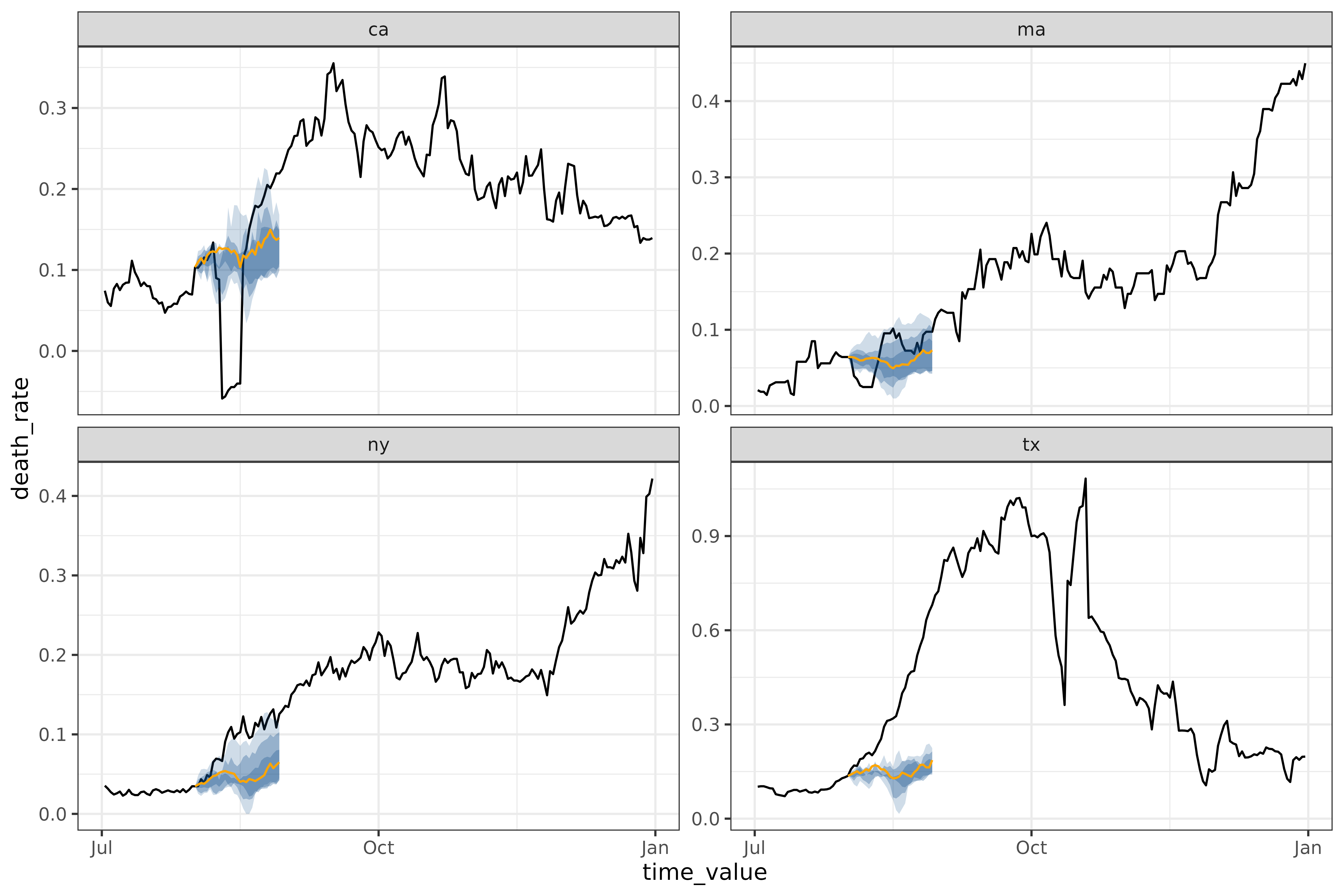
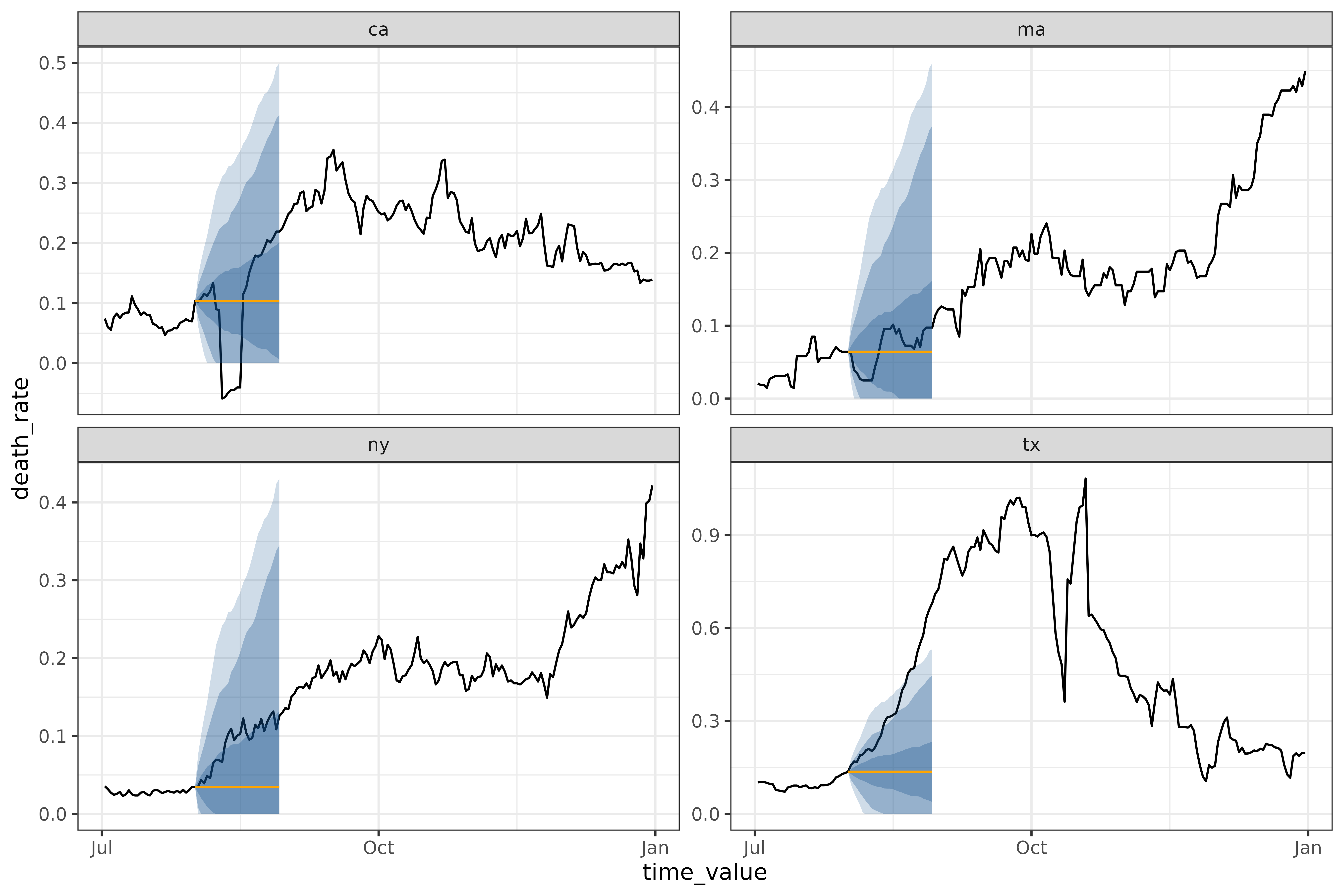
Other canned forecasters
flatline_forecaster()
The simplest model we provide is the
flatline_forecaster(), which predicts a flat line (with
quantiles generated from the residuals using
layer_residual_quantiles()). For example, on the same
dataset as above:
all_flatlines <- lapply(
  seq(0, 28),
  \(days_ahead) {
    flatline_forecaster(
      covid_case_death_rates |>
        filter(time_value <= forecast_date, geo_value %in% used_locations),
      outcome = "death_rate",
      args_list = flatline_args_list(
        ahead = days_ahead,
      )
    )
  }
)
# same plotting code as in the arx multi-ahead case
workflow <- all_flatlines[[1]]$epi_workflow
results <- purrr::map_df(all_flatlines, ~ `$`(., "predictions"))
autoplot(
  object = workflow,
  predictions = results,
  plot_data = covid_case_death_rates |> filter(geo_value %in% used_locations, time_value > "2021-07-01")
)
cdc_baseline_forecaster()
This is a different method of generating a flatline forecast, used as a baseline for the CDC COVID-19 Forecasting Hub.
all_cdc_flatline <-
  cdc_baseline_forecaster(
    covid_case_death_rates |>
      filter(time_value <= forecast_date, geo_value %in% used_locations),
    outcome = "death_rate",
    args_list = cdc_baseline_args_list(
      aheads = 1:28,
      data_frequency = "1 day"
    )
  )
# same plotting code as in the arx multi-ahead case
workflow <- all_cdc_flatline$epi_workflow
results <- all_cdc_flatline$predictions
autoplot(
  object = workflow,
  predictions = results,
  plot_data = covid_case_death_rates |> filter(geo_value %in% used_locations, time_value > "2021-07-01")
)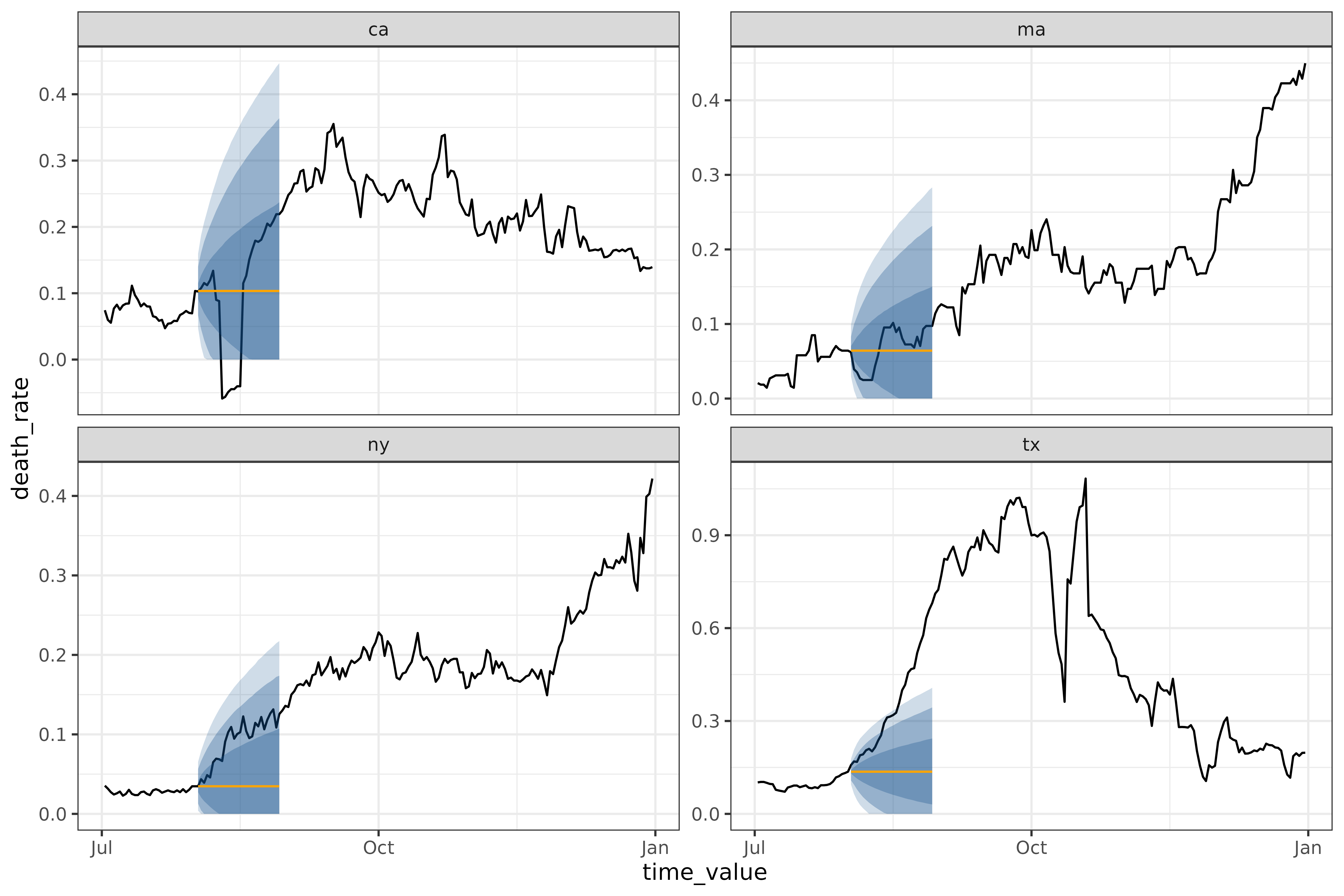
cdc_baseline_forecaster() and
flatline_forecaster() generate medians in the same way, but
cdc_baseline_forecaster()’s quantiles are generated using
layer_cdc_flatline_quantiles() instead of
layer_residual_quantiles(). Both quantile-generating
methods use the residuals to compute quantiles, but
layer_cdc_flatline_quantiles() extrapolates the quantiles
by repeatedly sampling the initial quantiles to generate the next set.
This results in much smoother quantiles, but ones that only capture the
one-ahead uncertainty.
climatological_forecaster()
The climatological_forecaster() is a different kind of
baseline. It produces a point forecast and quantiles based on the
historical values for a given time of year, rather than extrapolating
from recent values. For example, on the same dataset as above:
all_climate <- climatological_forecaster(
  covid_case_death_rates_extended |>
    filter(time_value <= forecast_date, geo_value %in% used_locations),
  outcome = "death_rate",
  args_list = climate_args_list(
    forecast_horizon = seq(0, 28),
    window_size = 14,
    time_type = "day",
    forecast_date = forecast_date
  )
)
workflow <- all_climate$epi_workflow
results <- all_climate$predictions
autoplot(
  object = workflow,
  predictions = results,
  plot_data = covid_case_death_rates_extended |> filter(geo_value %in% used_locations, time_value > "2021-07-01")
)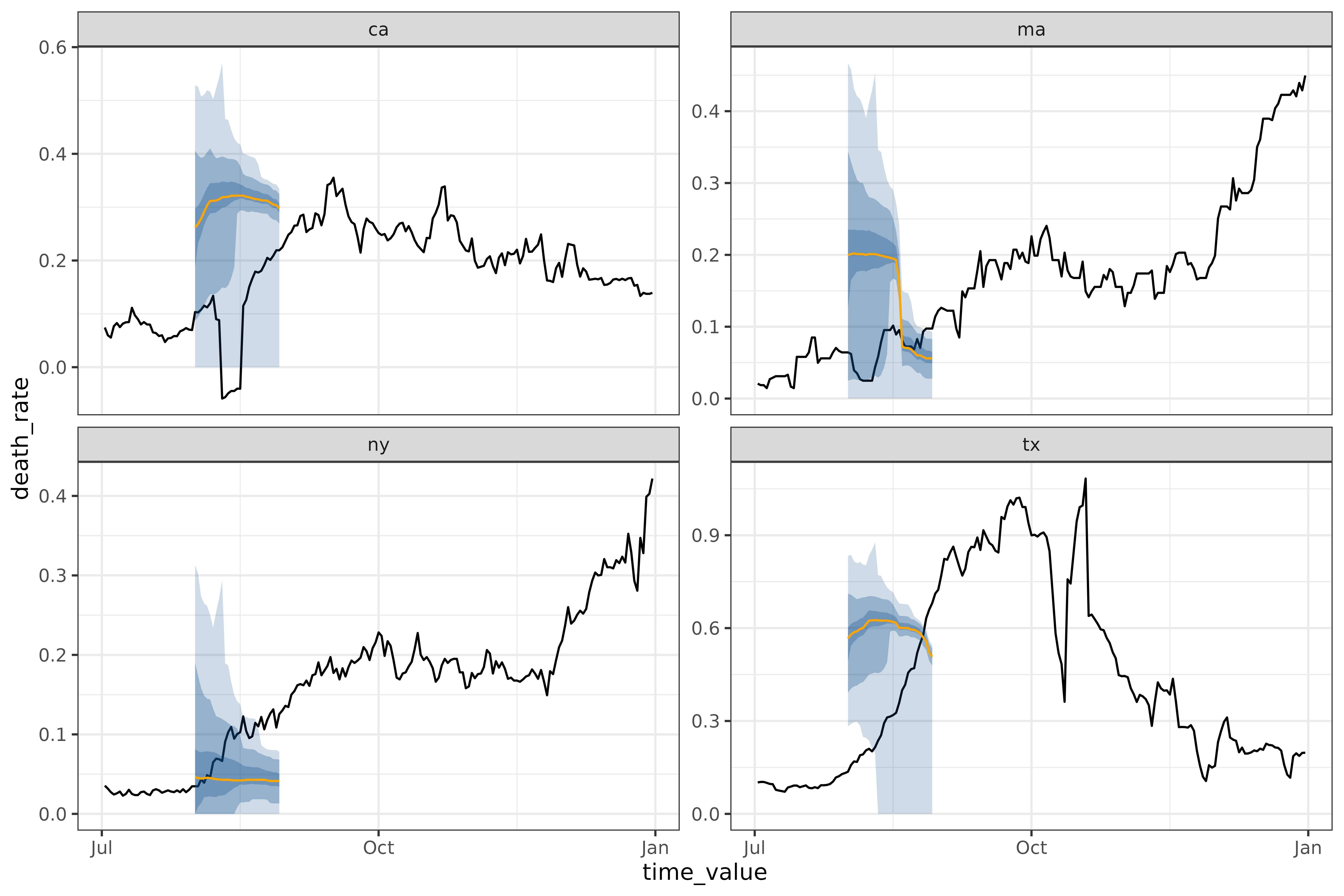
Note that to have enough training data for this method, we’re using
covid_case_death_rates_extended, which starts in March
2020, rather than covid_case_death_rates, which starts in
December. Without at least a year’s worth of historical data, it is
impossible to do a climatological model. Even with one year of data, as
we have here, the resulting forecasts are unreliable.
One feature of the climatological baseline is that it forecasts
multiple aheads simultaneously. This is possible for
arx_forecaster(), but only using
trainer = smooth_quantile_reg(), which is built to handle
multiple aheads simultaneously.
arx_classifier()
Unlike the other canned forecasters, arx_classifier
predicts binned growth rate. The forecaster converts the raw outcome
variable into a growth rate, which it then bins and predicts, using bin
thresholds provided by the user. For example, on the same dataset and
forecast_date as above, this model outputs:
classifier <- arx_classifier(
  covid_case_death_rates |>
    filter(geo_value %in% used_locations, time_value < forecast_date),
  outcome = "death_rate",
  predictors = c("death_rate", "case_rate"),
  trainer = multinom_reg(),
  args_list = arx_class_args_list(
    lags = list(c(0, 1, 2, 3, 7, 14), c(0, 7, 14)),
    ahead = 2 * 7,
    breaks = c(-0.01, 0.01, 0.1)
  )
)
classifier$predictions
#> # A tibble: 4 × 4
#>   geo_value .pred_class  forecast_date target_date
#>   <chr>     <fct>        <date>        <date>
#> 1 ca        (-0.01,0.01] 2021-07-31    2021-08-14
#> 2 ma        (-0.01,0.01] 2021-07-31    2021-08-14
#> 3 ny        (-0.01,0.01] 2021-07-31    2021-08-14
#> 4 tx        (-0.01,0.01] 2021-07-31    2021-08-14
The number and size of the growth rate categories is controlled by
breaks, which define the bin boundaries.
In this example, the custom breaks passed to
arx_class_args_list() correspond to 4 bins:
(-∞, -0.01), (-0.01, 0.01),
(0.01, 0.1), and (0.1, ∞). The bins can be
interpreted as: the outcome variable is decreasing, approximately
stable, slightly increasing, or increasing quickly.
The returned predictions assigns each state to one of
the growth rate bins. In this case, the classifier expects the growth
rate for all 4 of the states to fall into the same category,
(-0.01, 0.01].
To see how this model performed, let’s compare to the actual growth
rates for the target_date, as computed using
epiprocess:
growth_rates <- covid_case_death_rates |>
  filter(geo_value %in% used_locations) |>
  group_by(geo_value) |>
  mutate(
    deaths_gr = growth_rate(x = time_value, y = death_rate)
  ) |>
  ungroup()
growth_rates |> filter(time_value == "2021-08-14")
#> An `epi_df` object, 4 x 5 with metadata:
#> * geo_type  = state
#> * time_type = day
#> * as_of     = 2023-03-10
#>
#> # A tibble: 4 × 5
#>   geo_value time_value case_rate death_rate deaths_gr
#>   <chr>     <date>         <dbl>      <dbl>     <dbl>
#> 1 ca        2021-08-14      32.1    -0.0446   -1.39
#> 2 ma        2021-08-14      16.8     0.0953    0.0633
#> 3 ny        2021-08-14      21.0     0.0946    0.0321
#> 4 tx        2021-08-14      48.4     0.311     0.0721
Unfortunately, this forecast was not particularly accurate. All real
growth rates were larger than the predicted growth rates, with
California (real growth rate -1.39) not remotely in the
interval ((-0.01, 0.01]).
Fitting multi-key panel data
If multiple keys are set in the epi_df as
other_keys, arx_forecaster will automatically
group by those in addition to the required geographic key. For example,
predicting the number of graduates in each of the categories in
grad_employ_subset from above:
# only fitting a subset, otherwise there are ~550 distinct pairs, which is bad for plotting
edu_quals <- c("Undergraduate degree", "Professional degree")
geo_values <- c("Quebec", "British Columbia")

grad_employ <- grad_employ_subset |>
    filter(time_value < 2017) |>
    filter(edu_qual %in% edu_quals, geo_value %in% geo_values)

grad_employ
#> An `epi_df` object, 56 x 7 with metadata:
#> * geo_type  = custom
#> * time_type = integer
#> * other_keys = age_group, edu_qual
#> * as_of     = 2024-09-18
#>
#> # A tibble: 56 × 7
#>   geo_value        age_group      edu_qual           time_value num_graduates
#>   <chr>            <fct>          <fct>                   <int>         <dbl>
#> 1 Quebec           15 to 34 years Undergraduate deg…       2010         14270
#> 2 Quebec           35 to 64 years Undergraduate deg…       2010          1770
#> 3 Quebec           15 to 34 years Professional degr…       2010          1210
#> 4 Quebec           35 to 64 years Professional degr…       2010            50
#> 5 British Columbia 15 to 34 years Undergraduate deg…       2010          8180
#> 6 British Columbia 35 to 64 years Undergraduate deg…       2010          1100
#> # ℹ 50 more rows
#> # ℹ 2 more variables: med_income_2y <dbl>, med_income_5y <dbl>

grad_forecast <- arx_forecaster(
  grad_employ |>
    filter(time_value < 2017),
  outcome = "num_graduates",
  predictors = c("num_graduates"),
  args_list = arx_args_list(
    lags = list(c(0, 1, 2)),
    ahead = 1
  )
)
# and plotting
autoplot(
  grad_forecast$epi_workflow,
  grad_forecast$predictions,
  grad_employ,
)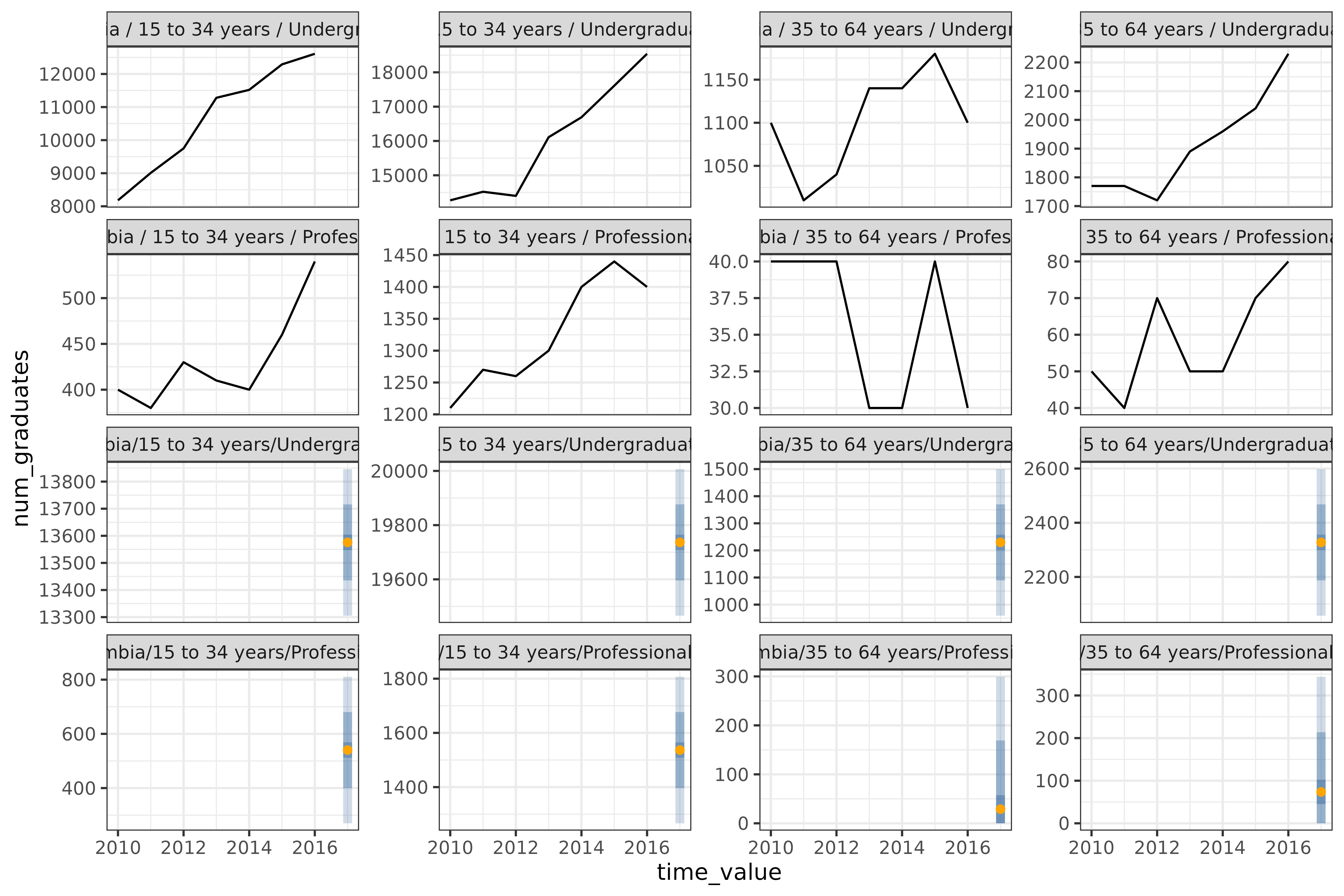
The 8 graphs represent all combinations of the
geo_values ("Quebec" and
"British Columbia"), edu_quals
("Undergraduate degree" and
"Professional degree"), and age brackets
("15 to 34 years" and "35 to 64 years").
Fitting a non-geo-pooled model
The methods shown so far fit a single model across all geographic
regions. This is called “geo-pooling”. To fit a non-geo-pooled model
that fits each geography separately, one either needs a multi-level
engine (which at the moment parsnip doesn’t support), or
one needs to loop over geographies. Here, we’re using
purrr::map to perform the loop.
geo_values <- covid_case_death_rates |>
  pull(geo_value) |>
  unique()

all_fits <-
  purrr::map(geo_values, \(geo) {
    covid_case_death_rates |>
      filter(
        geo_value == geo,
        time_value <= forecast_date
      ) |>
      arx_forecaster(
        outcome = "death_rate",
        trainer = linear_reg(),
        predictors = c("death_rate"),
        args_list = arx_args_list(
          lags = list(c(0, 7, 14)),
          ahead = 14
        )
      )
  })
map_df(all_fits, ~ pluck(., "predictions"))
#> # A tibble: 56 × 5
#>   geo_value  .pred .pred_distn forecast_date target_date
#>   <chr>      <dbl>   <qtls(7)> <date>        <date>
#> 1 ak        0.0787    [0.0787] 2021-08-01    2021-08-15
#> 2 al        0.206      [0.206] 2021-08-01    2021-08-15
#> 3 ar        0.275      [0.275] 2021-08-01    2021-08-15
#> 4 as        0              [0] 2021-08-01    2021-08-15
#> 5 az        0.121      [0.121] 2021-08-01    2021-08-15
#> 6 ca        0.0674    [0.0674] 2021-08-01    2021-08-15
#> # ℹ 50 more rows
Fitting separate models for each geography is both 56 times slower2 than geo-pooling, and fits each model on far less data. If a dataset contains relatively few observations for each geography, fitting a geo-pooled model is likely to produce better, more stable results. However, geo-pooling can only be used if values are comparable in meaning and scale across geographies or can be made comparable, for example by normalization.
If we wanted to build a geo-aware model, such as a linear regression with a different intercept for each geography, we would need to build a custom workflow with geography as a factor.
Anatomy of a canned forecaster
Code object
Let’s dissect the forecaster we trained back on the landing page:
four_week_ahead <- arx_forecaster(
  covid_case_death_rates |> filter(time_value <= forecast_date),
  outcome = "death_rate",
  predictors = c("case_rate", "death_rate"),
  args_list = arx_args_list(
    lags = list(c(0, 1, 2, 3, 7, 14), c(0, 7, 14)),
    ahead = 4 * 7,
    quantile_levels = c(0.1, 0.25, 0.5, 0.75, 0.9)
  )
)
four_week_ahead has two components: an
epi_workflow, and a table of predictions. The
table of predictions is a simple tibble,
four_week_ahead$predictions
#> # A tibble: 56 × 5
#>   geo_value  .pred .pred_distn forecast_date target_date
#>   <chr>      <dbl>   <qtls(5)> <date>        <date>
#> 1 ak        0.234      [0.234] 2021-08-01    2021-08-29
#> 2 al        0.290       [0.29] 2021-08-01    2021-08-29
#> 3 ar        0.482      [0.482] 2021-08-01    2021-08-29
#> 4 as        0.0190     [0.019] 2021-08-01    2021-08-29
#> 5 az        0.182      [0.182] 2021-08-01    2021-08-29
#> 6 ca        0.178      [0.178] 2021-08-01    2021-08-29
#> # ℹ 50 more rows
where .pred gives the point/median prediction, and
.pred_distn is a dist_quantiles() object
representing a distribution through various quantile levels. The
[6] in the name refers to the number of quantiles that have
been explicitly created3. By default, .pred_distn
covers a 90% prediction interval, reporting the 5% and 95%
quantiles.
The epi_workflow is a significantly more complicated
object, extending a workflows::workflow() to include
post-processing steps:
four_week_ahead$epi_workflow
#>
#> ══ Epi Workflow [trained] ═══════════════════════════════════════════════════
#> Preprocessor: Recipe
#> Model: linear_reg()
#> Postprocessor: Frosting
#>
#> ── Preprocessor ─────────────────────────────────────────────────────────────
#>
#> 7 Recipe steps.
#> 1. step_epi_lag()
#> 2. step_epi_lag()
#> 3. step_epi_ahead()
#> 4. step_naomit()
#> 5. step_naomit()
#> 6. step_training_window()
#> 7. check_enough_data()
#>
#> ── Model ────────────────────────────────────────────────────────────────────
#>
#> Call:
#> stats::lm(formula = ..y ~ ., data = data)
#>
#> Coefficients:
#>       (Intercept)    lag_0_case_rate    lag_1_case_rate    lag_2_case_rate
#>         0.0190429          0.0022671         -0.0003564          0.0007037
#>   lag_3_case_rate    lag_7_case_rate   lag_14_case_rate   lag_0_death_rate
#>         0.0027288          0.0013392         -0.0002427          0.0926092
#>  lag_7_death_rate  lag_14_death_rate
#>         0.0640675          0.0347603
#>
#> ── Postprocessor ────────────────────────────────────────────────────────────
#>
#> 5 Frosting layers.
#> 1. layer_predict()
#> 2. layer_residual_quantiles()
#> 3. layer_add_forecast_date()
#> 4. layer_add_target_date()
#> 5. layer_threshold()
#>
An epi_workflow() consists of 3 parts:
-
Preprocessor: a collection of steps that transform the data to be ready for modelling. Steps can be custom, as are those included in this package, or be defined in{recipes}.four_week_aheadhas 5 steps; you can inspect them more closely by runninghardhat::extract_recipe(four_week_ahead$epi_workflow).4 -
Model: the actual model that does the fitting, given by aparsnip::model_spec.four_week_aheaduses the default ofparsnip::linear_reg(), which is a parsnip wrapper forstats::lm(). You can inspect the model more closely by runninghardhat::extract_fit_recipe(four_week_ahead$epi_workflow). -
Postprocessor: a collection of layers to be applied to the resulting forecast. Layers are internal to this package.four_week_aheadjust so happens to have 5 of as these well. You can inspect the layers more closely by runningepipredict::extract_layers(four_week_ahead$epi_workflow).
See the Custom Epiworkflows
vignette for recreating and then extending
four_week_ahead using the custom forecaster framework.
Mathematical description
Let’s look at the mathematical details of the model in more detail,
using a minimal version of four_week_ahead:
four_week_small <- arx_forecaster(
  covid_case_death_rates |> filter(time_value <= forecast_date),
  outcome = "death_rate",
  predictors = c("case_rate", "death_rate"),
  args_list = arx_args_list(
    lags = list(c(0, 7, 14), c(0, 7, 14)),
    ahead = 4 * 7,
    quantile_levels = c(0.1, 0.25, 0.5, 0.75, 0.9)
  )
)
hardhat::extract_fit_engine(four_week_small$epi_workflow)
#>
#> Call:
#> stats::lm(formula = ..y ~ ., data = data)
#>
#> Coefficients:
#>       (Intercept)    lag_0_case_rate    lag_7_case_rate   lag_14_case_rate
#>         0.0186296          0.0041617          0.0026782         -0.0003569
#>  lag_0_death_rate   lag_7_death_rate  lag_14_death_rate
#>         0.0929132          0.0641027          0.0348096
If is the death rate on day and is the case rate, then the model we’re fitting is:
For example,
is lag_0_death_rate above, with a value of 0.0929132, while
is 0.0026782.
The training data for fitting this linear model is constructed within
the arx_forecaster() function by shifting a series of
columns the appropriate amount – based on the requested
lags. Each row containing no NA values is used
as a training observation to fit the coefficients
.